9
The
Minute Bus
by Keith C. Hall
October 2018
originally published
Aug. 2, 2017 on LinkedIn
American transit planners often say that Americans won't take a bus to a train. I argue that it is true only because we provide really shitty bus service to our rail stations. Therefore, we must build park-and-ride lots to provide access. And our enormous park-and-ride lots take up so much land that there's no room to build cities around our rail and bus stations.
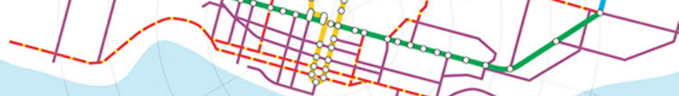
This discussion takes a quick look at four cities: Atlanta, Dallas, Seattle, and Toronto.
A few caveats: This is a really quick look at peak period, peak direction bus service in the 7:00-7:59 a.m. hour to identify peak headways (in other words, it's more of a a faster look than a thorough analysis, so there may be a few errors). In Atlanta and Dallas, I combined routes to identify where frequencies were higher. In Seattle, the complexity of the network would have required much more time identifying overlapping routes throughout the city, but it wasn't worth it because the bus network, while frequent, is pretty poorly integrated with the city's one light rail line. Toronto operates a grid network, so there are relatively few overlapping routes to identify (it was the easiest analysis of all, and this simplicity might also be another way of saying that it's an easy-to-use system for its users).
As for the graphics, they are not exactly to scale. In general, the center circle is downtown, and the rings are roughly two kilometers apart (-ish). The outer ring is where I squashed everything in the boondocks, so there is no scale at all in the outermost ring. Toronto required the least "squashing," while Dallas required the most. Seattle's unusual network (due to topography and water bodies) reflects a bit of graphic creativity. The need to squeeze in the systems to fit the graphics is a subtle reflection on focus of these systems' designs: Toronto's is very urban, while the American systems reflect the political need to build outward to serve the suburbs, even as they effectively abandon decent transit service in central cities.
I could discuss the opportunities for Lyft, Uber, autonomous vehicles, better and well-connected walking and cycling infrastructure, jet packs and flying cars, monorails, maglevs, and a host of other futuristic technologies from the 1950s to now, but I'll refrain.
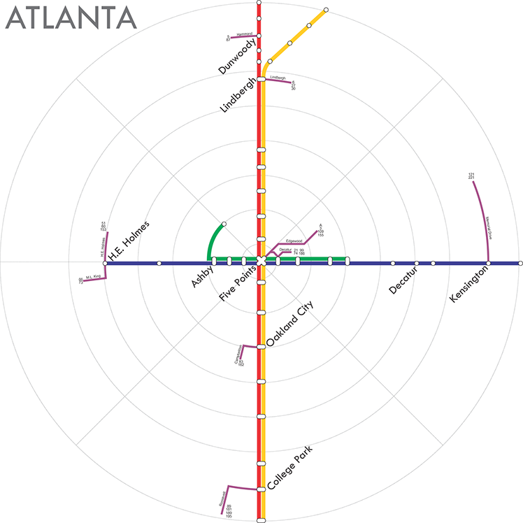
Atlanta operates peak period rail services every ten minutes on each line. Given the overlap in trunk service, most stations have rail service every five minutes; only the outlying branches suffer with lesser frequency of service (there aren't that many stations on the branches). If Atlanta ever had a bus feeder network in place to bring passengers to its rail system, only a few remnants of that system remain today. The underutilized and sometimes unused bus loops at rail stations may provide archaeological evidence that a larger number of buses once connected to the rail system. Today's system of 102 bus routes in Atlanta includes exactly zero routes that operate better than ten minute service in peak periods. Around a quarter of Atlanta's bus routes operate peak period service of fifteen minutes or better, only five of which operate every twelve minutes. The average headway for a bus route is 28 minutes (the median is 30 minutes), and this is as good as it gets in Atlanta.
To get to better-than-ten-minute service in Atlanta, you have to rely on two or more bus routes operating on the same road (these route segments are shown in purple). In most cases, the remaining remnants of the bus system are just two to four routes that operate on a short shared alignment to provide a combined headway of better than ten minutes. Most of these short segments are no more than a kilometer or two from a station, but there is a stretch of nearly eight kilometers from Kensington Station to the edge of Stone Mountain, providing a frequent connection between a park-and-ride lot and a commercial corridor to the rail system.
Despite the fact that Atlanta's rail system is fast and efficient, it is far less effective than it should be. Coupled with the nearly non-existent network of frequent buses is a failure in land use planning; the City's planning department - through its zoning codes - remains committed to maintaining the region's low density and scattered development patterns. Although high-rise commercial and residential towers continue to be built in Midtown, an area on the north trunk line, the focus of most residential and employment growth continues to be beyond the reach of the transit system. The most basic day-to-day trips are extremely difficult to accomplish on transit.
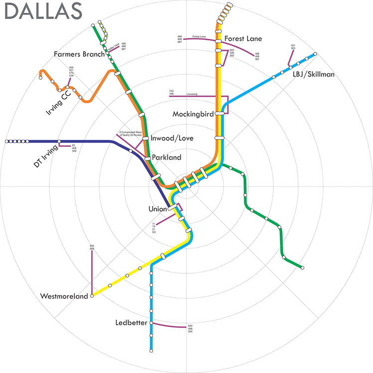
Dallas operates peak period rail services every fifteen minutes on each line. Given the overlap in trunk service, many stations have rail service every 7.5 minutes, and downtown stations have service every 3-4 minutes. Dallas (excluding the exurburban regions connected by longer-distance rail lines) operates 131 bus routes, many of them specifically designed as feeders to rail stations, but most other routes also connect to rail stations (so what's the distinction between local routes and rail feeders?).
Like Atlanta, Dallas has a large number of infrequent bus routes, including most rail feeder buses. The average frequency is 26 minutes (the median is 30). Only three bus routes offer better-than-ten minute headways; two are express routes not designed to link to the rail system, and the other is a hospital shuttle that links SWMC/Parkland Station to hospitals within a complex maze of zig-zagging routes designed on an impossible-to-read map (in the interest of time, I gave up trying to decipher the similarly complex network of downtown buses, too). Like Atlanta, you will find frequent bus service only for a short distance from a Dallas rail station owing only to the overlap in bus routes as they converge on stations. You might be able to find frequent bus in the medical center, but only after you spent several hours deciphering the map. If you end up downtown, you'd just walk; the downtown bus system makes no sense at all, and the major transfer locations are curiously located a block or two away from rail stations. And good luck finding a supermarket near any of the rail stations.
Dallas' rail system is relatively fast, but like Atlanta the city has also failed to build any sort of success on the rail system through land use planning (Dallas claims to "do TOD," but the reality is that Dallas TOD is a large parkade with a few shops at ground level). Perhaps to an even greater extent than Atlanta - and despite a more expansive rail network - most of Dallas' growth is also occurring well outside the influence of the rail network (Dallas-Fort Worth is a slightly larger city-region than Atlanta). Dallas may have the largest light rail system in the country, but it is among the least efficient in the usual performance measures (cost per passenger mile, passengers per vehicle revenue hour, etc.).
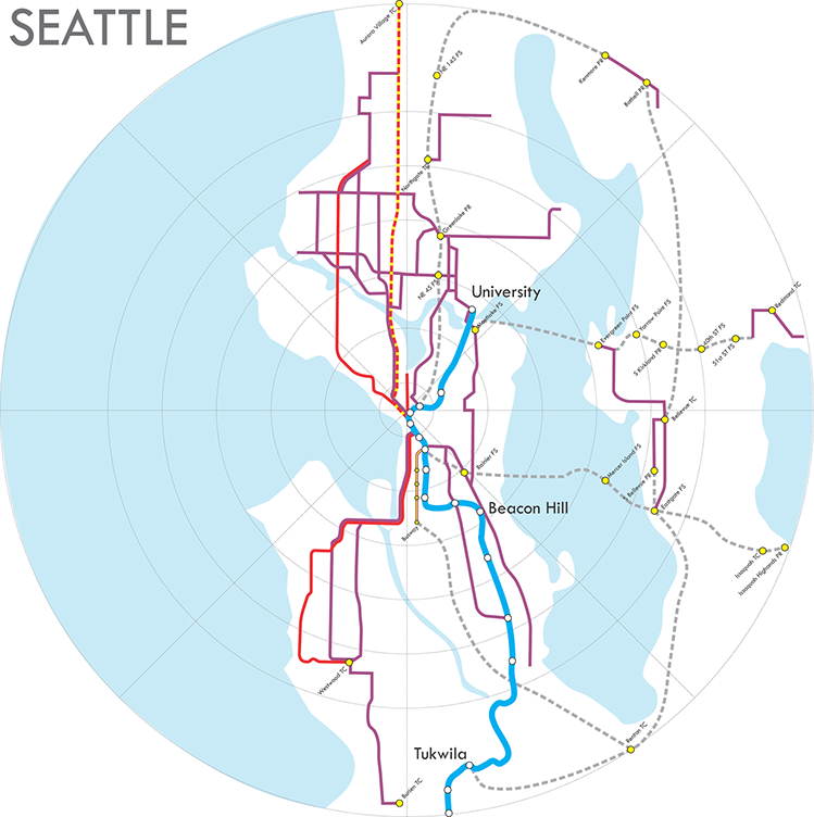
Seattle has a single light rail line that snakes through the city from south of the airport through downtown to the University of Washington. Service runs every 6 minutes, and ridership is good, especially on the short but extremely busy downtown-to-university segment. What is quickly obvious from the map above is that the network of frequent bus routes is extensive, but it is not well integrated with the rail system. Although numerous bus routes allow transfers in downtown Seattle, there are relatively few frequent bus routes that make a useful crosstown transfer to the rail system south of downtown (and it is generally a terrible transfer where buses and rail stations do intersect). A few more buses transfer to the University of Washington station, but it is still not what I would consider a convenient "integrated" transfer. And what's more than just a little annoying to me is that the 194 tunnel bus made the trip from the airport to the Westlake tunnel station in 29 minutes, but today's light rail takes 40 (but light rail is more frequent and has more room for passengers).
Today's system of more than 165 bus routes in Seattle (including Sound Transit routes that operate only within King County but excluding all buses that operate across county lines) includes 25 routes that operate better than ten minute service in peak periods, one of which operates about every 4.5 minutes (the super-frequent Aurora Rapid Ride route is indicated in the red/yellow dotted line and is where light rail really should have been built, while the better-than-ten minute Rapid Ride routes are shown in solid red, along with frequent local/express routes in purple; the 10-minute Rapid Ride routes are, of course, not shown, because I aim for better-than-ten-minute service). The average headway for a bus route in Seattle is 24 minutes (the median is 20 minutes). In other words, even though bus service isn't well-integrated with rail, there is much more bus service per capita and a higher ratio of frequent services in Seattle than in Atlanta or Dallas despite its being a much smaller city-region in both population and geographic area.
In Seattle, there are a number of separate routes that are functionally branches of each other, but they are treated as separate routes in this exercise because that is the way they are locally classified. In other words, for many of the related route sets, the actual frequency is much better than what is suggested in this analysis simply because I considered "related" routes as separate routes, consistent with local convention. There are also "unrelated" routes that overlap throughout the city, as well, even if for only short distances. This gives frequent service along many more route segments than the map suggests (and offers easy transfers between routes that overlap but serve different destinations).
Another distinct feature of Seattle's bus network is the well-developed two-way, all day express bus network (the local portion of express routes are shown in purple, while the gray dashed lines indicate non-stop service). A number of freeway stations, transit centers, and park-and-ride lots, as well as a small busway (all with yellow stations), are served by numerous overlapping routes, giving them extremely frequent service to downtown and other major employment destinations.
Though Seattle's rail system is relatively efficient, much better bus-rail integration is needed, particularly south of downtown. Unfortunately, topography is a significant obstacle to an efficient bus network design. And though Seattle, like other American cities, needs a better land use planning approach around rail stations, the City actually has done a relatively good job in planning transit-level densities in key bus corridors.
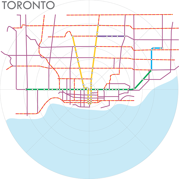
Toronto operates peak period rail services every two to three minutes on each of its rapid transit lines. Whereas the American examples are case studies in poor bus network integration a the rail system, Toronto is the opposite. Toronto's bus routes "hang" off the subway system in a textbook example of integrated bus-rail system design, but it can thank its relatively flat topography and a strong gridiron arterial network for the ease in bus service planning. As with the other cities, this ignores suburban transit connections, such as Mississauga Transit's frequent service to Toronto's Islington subway station and the downtown-focused GO Transit network.
Of Toronto's 150 bus and streetcar routes, 80 operate at least every ten minutes in the peak period. Of those, 65 routes operate better than every 10 minutes (purple lines), and 16 of those operate better than 5 minutes (red-yellow dashed lines). The success of Toronto's feeder buses mean that thousands of people pour into a subway system that offers (and needs) very few park-and-ride spaces. The average bus frequency is under 12 minutes (the median is 10 minutes). Given the widespread areas of the city served by the frequent bus network and the easy bus-to-subway connections, it is no surprise that Toronto's relatively small rapid transit system is one of North America's most heavily used - for both bus and rail services. The argument for giving away free rides disappears in Toronto; the transit system enjoys a 70+% fare recovery ratio; despite the higher level of service and higher fares, it requires less of an operating subsidy.
One difference between Toronto and Seattle is that Seattle's various route branches are considered distinct and separate routes, while Toronto often has two or three route branches that are considered part of the same route. That is an important distinction because it affects this analysis; three "related routes" in Seattle are considered three different routes (each with lower frequency of service), while three "route branches" in Toronto are considered a single route (with a greater combined frequency on the common trunk), even though "related routes" are essentially the same thing as "routes with branches." The map excludes route branches that don't meet the better-than-ten minute threshold.
But the differences between Seattle and Toronto are far more significant than how routes are defined. Most of Toronto's subway stations have very good transfer interfaces with bus and streetcar routes; buses and streetcars directly enter the fare paid areas of most stations, making transfers easy and fast for both passengers who can transfer quickly and drivers who don't have to deal with fares and transfers. In contrast, rail station transfers in Seattle are practically an infrastructure planning and design disaster; the bus-rail interface in Seattle is terrible at nearly all stations. Even Atlanta has done better with its infrastructure to support transfers between bus and rail, but Atlanta unfortunately lacks buses that could use the transfer facilities (obviously, this is less of a problem for buses than for passengers).
Toronto's transit system is also a textbook case on integrating land use and transportation decision-making. Space that otherwise would have been a big park-and-ride lot in the American approach is turned over to high-density, mixed-use development that also feeds passengers into the subway system. Although the subway system is underground, a Google map satellite view of the city intuitively reveals where the subway is located; the highest density high-rise neighborhoods follow the core routes of the subway system. However, many high-rise buildings have been built on the frequent bus network, as well.
a publication of